
Japandi Kitchen Design: A Guide to Serene, Functional Spaces
A complete introduction to Japandi kitchen design — where Japanese wabi-sabi meets Scandinavian hygge, and how to bring the look home without a renovation.
21 min read
Read wood undertones, test daylight and evening light, and compare verified paint references with a sampling worksheet.
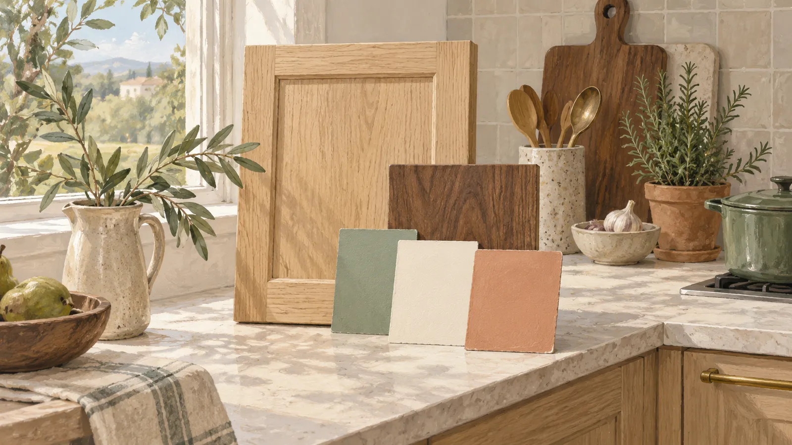
AI-generated editorial illustration; a conceptual scene, not a product photograph.
Japandi kitchen colours work best with wood when they respond to the wood’s undertone and the room’s actual light. Start with a restrained group of warm whites, soft beige or muted greens, then sample them beside the cabinets, floor and worktop. A colour that looks quiet online may appear yellow, pink or cold in your kitchen.
Choose the largest fixed material first. If the oak cabinets and brown floor will stay, they belong in every colour decision. Bring paint samples home and compare them with those fixed materials before choosing a colour.
Oak can look pale, golden, pinkish or brown depending on species, stain and finish. Walnut may appear rich brown in one room and more muted in another. Look at the finish on your own cabinets; two oak doors can have quite different colours.
Hold a plain white card beside the cabinet and floor. Notice what becomes more visible: yellow, orange, red, grey or a mixture. Repeat the exercise near the window and in a shaded corner. Note the colour you see most clearly and use it when comparing paint samples.
Include the worktop and backsplash. A cream tile can make a clean white cabinet look cooler; a grey worktop can change how a beige wall reads. Benjamin Moore’s kitchen cabinet guidance recommends considering the surrounding finishes rather than selecting a cabinet colour in isolation.
For examples of how wood, pale surfaces and restrained accents work together, see the Japandi design guide.
Choose one quiet background, one material colour and one optional accent. The background might be a soft white wall. The material colour might be the existing oak. The accent could be a muted green cabinet section or a small clay-coloured textile.
Use those three roles as a starting point and adjust the balance to your room. A room with extensive wood can use less added colour. A white rental kitchen may get its wood texture from a nearby table and a few useful objects.
Avoid choosing the wall, cabinet and backsplash colours independently. Put the samples together so you can see the whole relationship. If the group needs several accessories to make it feel connected, simplify it before adding more objects.
These references were checked on manufacturers’ pages on 11 October 2026. We have not tested them against particular timbers, so sample them beside your own wood before buying paint. The Benjamin Moore links are US-market references; Farrow & Ball is linked to its UK site. Availability, paint systems and prices vary by country.
| Reference | Manufacturer’s colour direction | An editorial use to try | What to check in your room |
|---|---|---|---|
| Benjamin Moore White Dove OC-17 | A soft white | Background beside visible wood | Relationship with existing white trim and cream tile |
| Benjamin Moore Pale Oak OC-20 | A light neutral with warm grey character | Wall or painted cabinet sample | Whether it reads too pink or muted beside your floor |
| Benjamin Moore Saybrook Sage HC-114 | A muted green | A limited cabinet area or accent | Daylight and the wood’s yellow or red tones |
| Farrow & Ball School House White No. 291 | A soft off-white | Background for wood and neutral surfaces | Whether surrounding pale finishes make it appear darker |
Once you have chosen the colour, select a paint product suited to the wall or cabinet material and follow its preparation requirements. A colour match mixed by another brand may behave differently, so sample that actual paint too.
Observe the kitchen when you cook, not only at the brightest moment of the day. Direct sun, shaded daylight and electric lighting can make the same group of materials look different. Nearby buildings and coloured outdoor surfaces can also affect what you see indoors.
Do not choose paint solely from the compass direction of a window. Hemisphere, season, obstructions and the time you use the room matter. A north-facing kitchen in one location does not automatically need the same treatment as a north-facing kitchen elsewhere.
At night, compare samples under the lights you intend to keep. If those lights will change, test the proposed lighting before committing to paint. Our Japandi lighting guide covers task light, ambient light and glare.
Use photographs as notes, but trust the physical samples. Phones and screens alter colour, and manufacturers warn that digital representations can differ from paint. A screenshot should not be the final approval for a whole kitchen.
Use the manufacturer’s recommended sampling method on a suitable board or test area. A movable board can be helpful because you can place it beside several fixed materials. Keep the finish and number of coats consistent with the sample instructions.
| Check | Sample A | Sample B | Sample C |
|---|---|---|---|
| Beside cabinet wood in daylight | ___ | ___ | ___ |
| Beside floor and worktop | ___ | ___ | ___ |
| Beside existing trim or backsplash | ___ | ___ | ___ |
| In the darkest corner | ___ | ___ | ___ |
| Under evening lights | ___ | ___ | ___ |
| Does it still look appealing on another day? | ___ | ___ | ___ |
Record observations in ordinary words: “looks too yellow by the tile,” “gentle beside the oak,” or “grey at night.” Those notes are more useful than a list of fashionable colour descriptions.
Do not surround a tiny sample with several unrelated test patches and assume that is how a full wall will look. Compare manageable candidates, then test the favourite at a more useful scale before purchasing all the paint.
For pale oak cabinets with a warm stone-coloured worktop, try a soft white background and a small muted green accent. Keep the backsplash quiet so the wood remains visible. Sample the white and green together before committing; their relationship with your oak may differ.
For darker walnut doors, try a pale background that still relates to the worktop. Let the wood provide the darker tone. Before adding black hardware, a black shelf or a dark pendant, check whether the room already has enough contrast.
For reddish existing timber, compare several neutrals directly beside it. A green may make the red more noticeable through contrast, which you may enjoy or dislike. Decide from the sample rather than assuming green always “balances” wood.
If the kitchen contains two woods, find a background that works with both. Repeat one of them elsewhere only when it serves a useful purpose.
A low-sheen wall and a cabinet finish can show the same colour differently. Choose the finish for the surface’s use and cleaning requirements, then sample it where possible. Avoid picking a delicate finish merely because it looks soft in a photograph.
For cabinet choices, read our wood, painted and mixed cabinet guide. If a budget is tight, use the makeover priorities to decide whether paint is the change the room needs most.
Choose from the samples you still like beside the wood in daylight and under your evening lights.
Sources describe their own scope and limitations. Read our sourcing policy.
Read more from the Japandi & Zen Design pillar.
Japandi

A complete introduction to Japandi kitchen design — where Japanese wabi-sabi meets Scandinavian hygge, and how to bring the look home without a renovation.
21 min read
Apply Japandi ideas to single-wall, galley and compact L-shaped apartment kitchens without crowding the working space.
6 min read
Compare visible wood, painted and mixed kitchen cabinets by appearance, construction, care and repair options.
7 min read